Here is the R code used.
Different types of data requires or enables different kinds of visualizations.
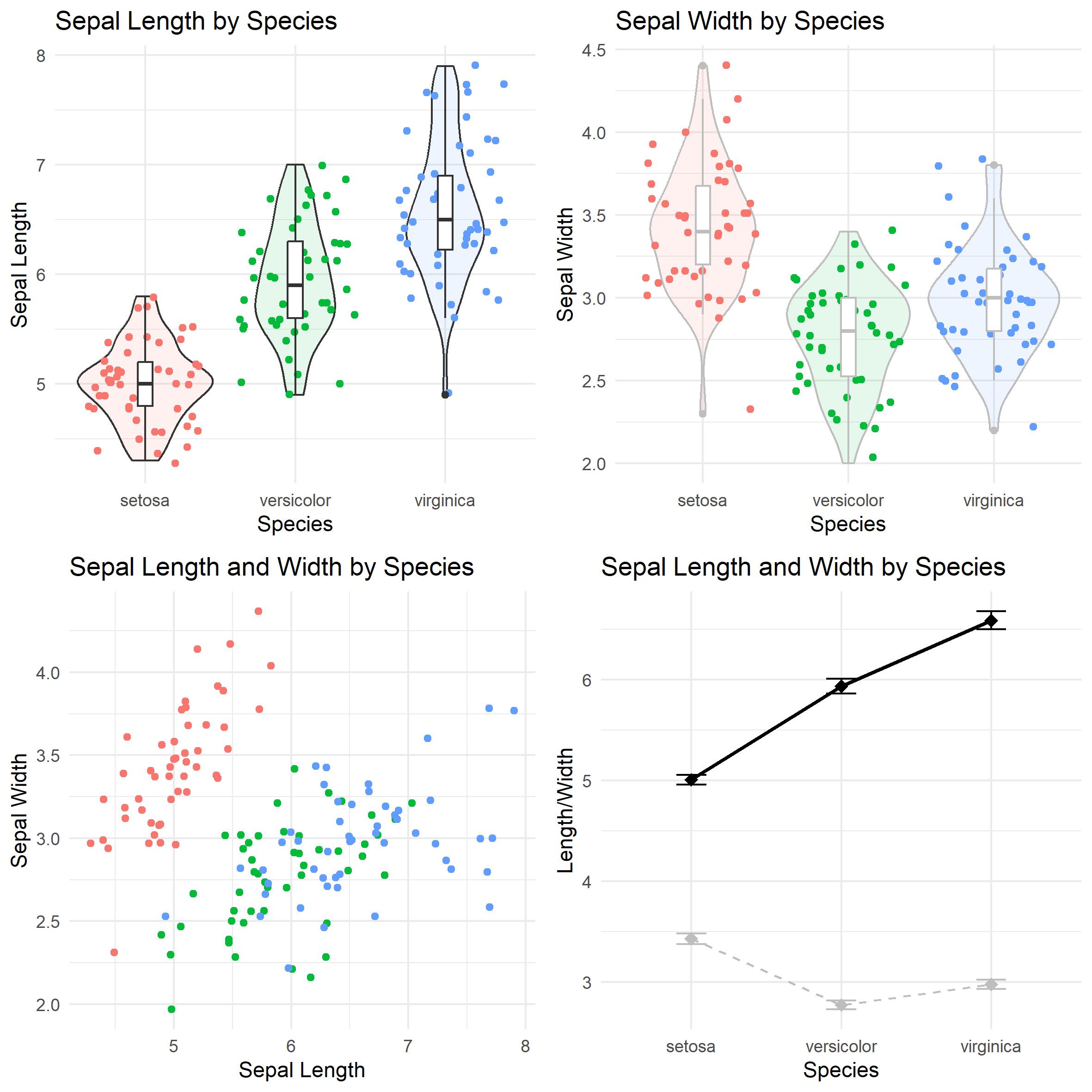
Take for example the "iris" dataset that is a standard part of R/Python data analysis examples. Each flower's specific attribute (it's sepal length/width is only listed once).
Here are somewhat standard ways to visualise the data:
Here is the R code used.
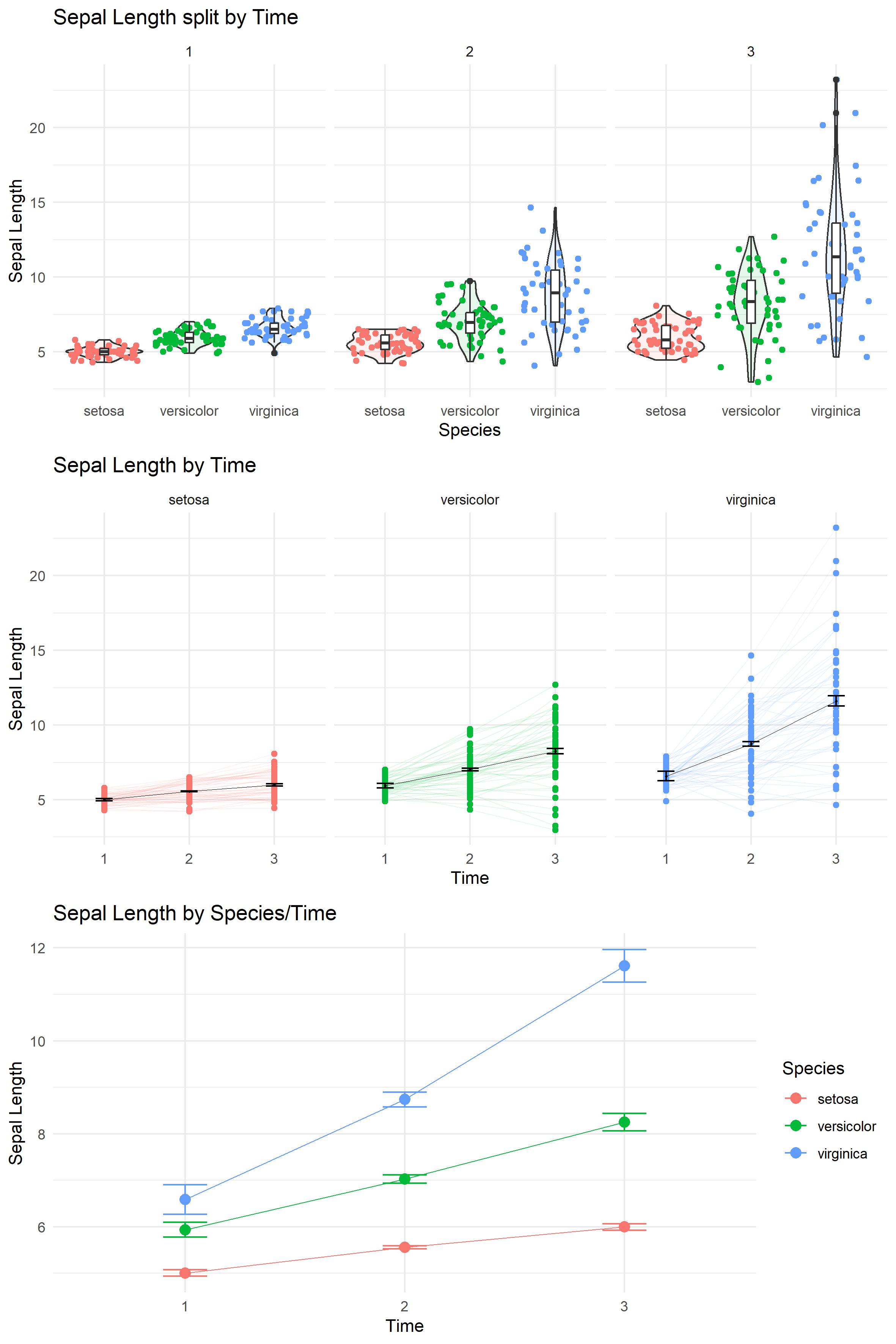
But what if there are multiple measurements across time, and we are interested more in difference across time than differences across species?
Taking the "iris" dataset again, we can simulate the sepal lengths at time 2 and 3 assuming there is some growth rate (e.g. 10% for one species, 20% and 30% for the others)
Here are somewhat standard ways to visualise that data now:
Here is the R code used.
Note that for the above visualizations, the errorbars should reflect within-subject/repeated-measures errors. Here we used the method suggested by Cousineau.